LA week 31 – Point of Sale and Brand Manual

Part A Consider the touchpoints of your brand in general (to ensure that all the elements work together) and then focus on your packaging. Design a set of Point of Sale elements that will promote your product in-store. The set can consist of however many elements you choose. It can be in any format that you would like it to be. Please consider the following:
1. Can customers clearly see your product in your Point of Sale elements?
Do you use your Point of Sale to also showcase your actual product?
2. Brand Integration
Does it integrate with the brand’s look and feel?
3. Designed to sell!
Does it persuade customers to buy your product?

Part B Brand manual.
Take pictures of your elements and include them in a presentation of your brand called a brand manual or a design manual. Your brand manual should have a minimum of 7 pages and include logo, color scheme and chosen typography as well as the different elements produced during this 4 week project period (brochure, infographic, packaging, point of sale). 
Hand in your brand manual as a PDF. Tip: Take a picture of a shop’s interior and use Photoshop to show your Point of Sale elements within a “real” environment.

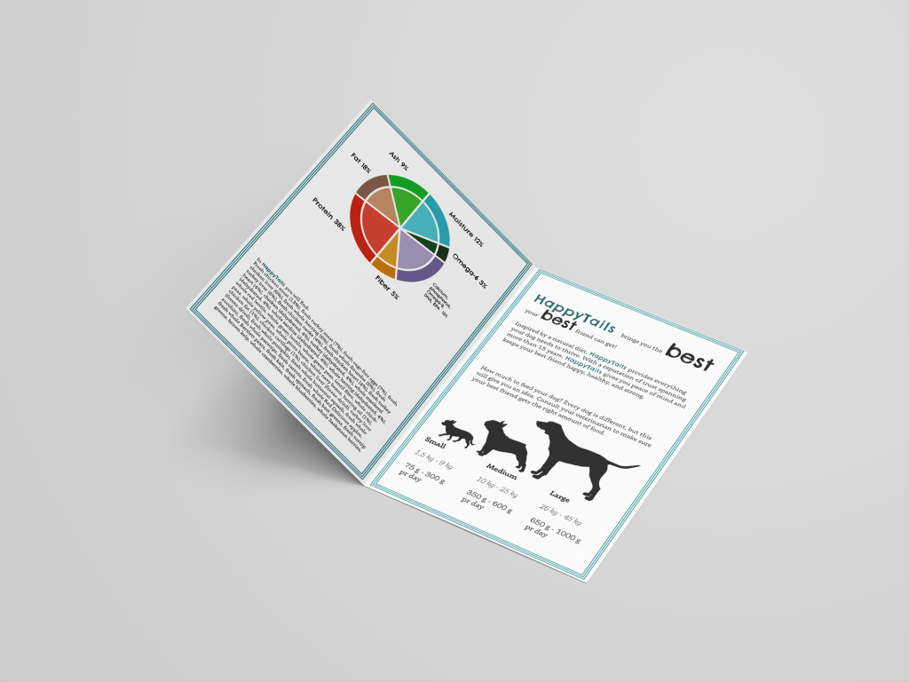
Here you can find my Brand Manual for HappyTails.

After delivering I, of course, found that I forgot to change what videos I had used on LinkedIn Learning for this project. Such an annoying mistake to make, but so be it! These were the videos I used:

William Everhart – Packaging Design
Steve Harris – Developing Brand Identity Collateral
John McWade – Learning Graphic Design: Things Every Designer Should Know

LA week 30 – Packaging Design

Using the logo you created in Week 1 and the brochure you designed in Week 2, think about your brand and design packaging for your product. Remember that you can decide about the detail of your product. Is it dog biscuits, meat products in a tin, dry pellets or a new and exciting product?  Do your design according to the following steps:

1 Exploration
Use sketching techniques to draw thumbnails and hand in your thumbnails as scanned PDFs.

2 Brand integration
Choose one of your thumbnails and refine your design. Place it next to your brochure and logo and see how you can merge your design with the brand identity. Also, what fundamentals of the brand can you draw from and use in your design?
Hand in a picture of your thumbnails, mock-ups, logo and brochure together.

3 Design
Now design your packaging properly, using any design application of your choice (or a combination of e.g. Photoshop, InDesign and Illustrator). Export the flat design as a PDF.

4 Presentation
Make a life-size mock-up of your final design and take photographs of it. Remember that you can take more than one photo to show the different angles and sides of the packaging. Here your presentation skills are vital. How do you present the final mock-up in a photo to reflect the true essence of your design?

So I went with the liquid vitamin and omega supplements-idea, in stead of the box I imagined in the beginning of this process. Hopefully this an okay approach. I started a more traditional box-design too, just to be on the safe side.

LA week 29 – Illustration, Infographic and Brochure

Use the logo you created in Week 1 and design a brochure for your product. You may use any format you like, just make sure that the format is in line with and adds to your logo design. Your brochure must contain an illustration. This could be the infographic alone, or it could be the infographic and the rest of the brochure (in other words, the entire brochure may be illustrated if you’d like).When designing the brochure and creating your illustration, make definite use of the fundamentals of visual language as discussed in this lesson. 

You must illustrate an infographic and design a brochure:

1. Illustration of infographic

The brochure design and infographic illustration should work together. Consider the format and style of your brochure and illustrate an infographic using fictitious data (or you could do research to get a better idea of actual statistics). The infographic must display the nutritious benefit of your product to dogs. It should contain the nutritional value, as compared to the necessary nutrition intake of dogs. It must also give an indication of consumption per size of dog. You may also add information of your choice that you think is relevant.

2. Design of brochure

Design a brochure that introduces your product and includes the infographic illustrated in Question 1. You can decide on the information and format of your brochure. As a guideline, consider a brochure of A4 (lying), folding to A5 (standing). You don’t have to have more than four pages in your brochure (but it depends on your design and style). You must base your brochure design on the design of your logo. Thus, look at your logo and design a brochure that complements and blends in with it.

I worked both in InDesign and Illustrator on this task, as well as making the mockups in Photoshop. I made the infographics in Illustrator, finding inspiration for the design online.

Resources:
The information used about dog food and nutrition came from Orijen, the picture of the dog (that looks very much like the dog in my logo, right?) came from Unsplash.com and vectors of dog silhouettes were found at Pixabay and Pixabay. Mockups came from Mockups-design.com.

LA week 27 – Market Your Website

Now that you have built and tested your website, I would like you to market it. Let’s say that your budget is NOK 10 000 (or 1800 $ US). Please do the following:

  • Do some research on what advertising costs. You could for instance contact your local newspaper, print shop and other websites.
  • Make a detailed list of how you would market your website. Remember to keep your budget in mind.
  • What if you had double the budget? Come up with a second marketing strategy, this time with NOK 20 000 at your disposal. (3600 $ US)
  • Come up with a viral idea. It doesn’t have to be a video; it can be guys dancing at the airport in gorilla suits. You can use ANYTHING that is at your disposal. Be creative!
Photo by Launchpresso on Pexels.com

Marketing of a website should primarily take place on the internet, and on the web you can find endless opportunities to market a website, from pricey to free.

The target group of this website is anyone considering visiting Voss. As Voss is a small town popular with tourists and extreme sports enthusiasts, I would like to use most of the budget on Google Ads, to target anyone who searches for Voss on Google. Google Ads allows you to use whatever budget you might have, and so it is easy to make it affordable for this budget. In addition to Google Ads I would have small flyers printed and placed at the tourist information, both in Voss and in Bergen, Norways second largest city only one hour away from Voss.

In addition to these paid markering strategies, use of Facebook and possibly other SoMe channels would need to be active and constant, to stay current and keep people interested.

Budget 10.000 NOK:
Google Ads: 8.000 NOK
Flyers: 2000 NOK

Doubling the budget would open a few more possibilities. Long term I would probably spend it on Google Ads, but if we wanted a more short term approach, in addition to Google Ads I would spend money on advertising on Facebook.

Budget 20.000 NOK:
Google Ads: 10.000 NOK
Flyers: 2.000 NOK
Facebook Ads: 8.000 NOK

A fun idea for a viral video marketing the website would be having the name of the website on the (fabric of the) parachutes above Voss, possibly making a video on Facebook of them jumping. (Voss is widely known for it’s extreme sports, and hosts the large festival Ekstremsportveko every year (except when there is a pandemic). The cost would mainly be printing on the fabric of the parachute, as I am sure there would be many willing to do the jump without a cost. Also the cost of the fuel for the airplane take the jumpers up would have to be take into the budget.

LA week 26 – Coding basics

Take the basic website you have designed in your previous two Learning Activities in this module (Learning Activity – Put Thought Into Your Design and Learning Activity – Planning the Structure) and convert that into HTML and CSS code.This will help you understand the importance between the design and the programming phase and how they work together.Don’t stress if you can’t get everything right, just do as much as you can.
Resources and equipment:
Previous two Learning Activities
Notepad on a PC or TextEdit on a Mac

I have still not quite made friends with css and html. I find it quite hard. I will keep working on this, obviously, and hope to make the site I’m working on functional soon. I used this week to catch up on two earlier LAs in addition to delivering MA06 two weeks late, so there simply were not enough time. I will try to get the site up and running within a few days.

LA weeks 22 and 25

LA week 22 – Put thought into your design
LA week 25 – Planning the structure

As I had not done these two LAs I had to finish them before delivering w26. Here they are, well out of the time frame, but so be it.

LA week 22 – Put thought into your design
Design a 5-page website or blog to promote your hometown (or any other place if you so choose). Present your design along with a strategy that explains the decisions you’ve made during the design process (keep the six steps mentioned in the lesson Web Design Process: Designing for Web (part 2) in mind). Remember, it’s important for us to see how you think, so explain why you decided to do things the way you did.This is a front-end design learning activity. No coding or publishing is needed. Please upload this activity to your WordPress blog along with a Word document or PDF explaining your st
rategy.
Resources and equipment:
Design software of your choice
Microsoft Word or a similar word processor

The six steps mentioned in the assignment are:

  1. You need to establish goals.
  2. Who is your audience?
  3. What is your brand’s image?
  4. Solve the problem.
  5. Measure your result.
  6. Always look for little improvements.

LA week 25 – planning the structure:
Create the structure of your web page (from Learning Activity – Put Thought Into Your Design) in terms of HTML files and folders. You need to set these up so that you are ready to code your website.
First use a pen and paper to do your planning; then do it on the computer when you are sure of your structure.
Please upload this activity to your WordPress blog. Remember to scan and include your initial planning that you did on paper.

Resources and equipment
Pen and paper
Scanner
Design software of your choice

References / Pictures:
Background picture on “website” is from Unsplash.com.

LA week 24 – Composition

Take a series of photographs, each photograph must focus on one of the following:

  • Pattern
  • Symmetry
  • Texture
  • Depth of field
  • Lines
  • Framing
  • Perspective
  • Space
  • Balance
  • Colour

Submit your ten best photographs to your blog.

Colour
Perspective
Framing

The green wire that I had to shoot this photo through makes for a soft framing of the tiger Boonya.

Lines
Space
Balance
Pattern
Depth of field
Symmetry
Texture

The texture of the lions mane is so beautiful, I can almost feel how soft it must feel to touch.

As I was stuck in the house this week, I had to find photos that I had taken earlier. Luckily I had taken quite a few when we were on holiday in Kristiansand. And the bridge.. Can you tell it’s a favourite?

LA week 23 – Studio Lighting

Question 1 – Written assignment

  • Name three lighting sources and their functions.
  • Name two light modifiers and explain the difference between them.
  • Draw a diagram of and describe the three-point lighting setup.

Three lighting sources:
Natural light – such as the sun and the moon, where no equipment is used to create light.
Flash lights – such as the flash on your camera. Can also be separate from the camera. Flashes when a picture is taken.
Continous lights – shines continuous and is a larger power drain. Also less mobile than flash light.

Light modifiers:
Reflectors – is used to cast directional light towards an object.
Umbrellas – is used to soften the light and spread it over a larger area.

Key Light – the main light source – used to light the subject.
Fill light – used to fill inn dark shadows and soften them.
Back light – placed behind the subject to highlight their shoulders and hair.

Question 2 – Research Assignment

  • Draw three studio setups for the following subject matters and list all the equipment that you would use to light your subjects:-Portrait-Fashion-Beauty

In a magazine or on the Internet, find one fashion shot, a beauty shot and a portrait shot and explain how you think the lighting was set up in each shot.

Bildet er tatt av Jeff Juit fra Pixabay

Fashion – in this image I believe there was used a strong key light from the models left side, and possibly a soft box from the models right side to soften the shadows just a little.

Bildet er tatt av Irina Gromovataya fra Pixabay

Beauty – in this image I think there were used a key light with a soft box high up from the models right side, and a soft box from her left, without any light from the back.

Bildet er tatt av Free-Photos fra Pixabay

Portrait – in this image I think there were used a key light with a oft box from the front, on the models left side, a fill light from her right and a back light from behind her left shoulder.

Question 3 – Practical assignments

Take some portrait shots and pay specific attention to the lighting you use. I would like to see a shot with soft lighting and one with more dramatic, harder lighting. It would be beneficial to hire studio lighting, but if you can’t, you may use natural light, reflectors and your camera’s flash.

I did not have access to to professional lighting, but I felt I learned a lot from using natural light as you can see from the two images I have chosen to share below.

This is Aslan, a lion at Dyreparken (Zoo in Kristiansand, Norway). As I spent this last week on vacation with my children, I was happy to find Aslan such a beautiful model for my portraits. It was a rather sunny day, but there were some clouds that softened the light. In this case the sun lit Aslan at an angle from behind, showing off his mane.

This is a photo of my daughter in sharp sunlight in the “golden hour”, just before sunset. Hard shadows hide her right side, yet the strong light bring out the color of her eyes and hair.

LA week 20 – Create a wireframe

Now it’s your turn to create your very own website wireframe.
In the last assignment, you had to come up with a list of 10 questions for a briefing form. I would like you to now fill in this briefing form, take the answers and create a wireframe for the site. This wireframe do not have to be a wireframe for your current Mandatory Assignment (Product Website) it’s purely for you to practice your skills. You can choose if you want it to be a lo-tech or hi-tech architecture.  Regardless of which method you choose, I would like to see as much detail as possible. Also, please write a short paragraph to explain why you chose the lo-tech or hi-tech option. Please upload this activity to your WordPress blog.

I imagined a website for a newly started business called Ellie Design, where the designer makes posters and other artworks that are sold through this website.

  1. What do you want to be the first thing a visitor to your website notices?
    The artwork that is sold.
  2. What actions do you want visitors to take on the site?
    Click on artwork and hopefully buy.
  3. What features should be used on your website? (This includes things like contact forms, pictures, videos, etc.)
    A lot of pictures if artwork to be sold, and also a contact form.
  4. What is the main purpose of your business?
    Making and selling artwork, mainly posters.
  5. What is your deadline for completing the site? How big is the budget?
    Deadline: 1 month from today. Budget: 10.000 NOK.
  6. Would you like to be part of building the website, or would you like to be delivered a finished product?
    Would like to see different layouts and weigh in on choices around artwork.
  7. What do you NOT want on your site in terms of text, content, colour and graphic elements?
    Nothing blinking.
  8. Do you expect to need support from me later on, after the website has been finished, or will your company manage on your own?
    May need support.
  9. Please list the names of three sites that you like and explain what you like about them.
    Pinterest.com – due to the enormous amount of inspiration available.
    Artstation.com – Allows for artists to showcase their art.
    Behance – allows air between art. Classy.
  10. Who will be the contact person for this project?
    The designer, Ellie.

I chose to make a lo tech wireframe as I am new to this, and it seems like the right place to start. Excited to learn more!

Design a site like this with WordPress.com
Get started