“Visit a popular store, like an Apple reseller, Nike, Levi’s, H&M or Ikea. The brand should be well-known and you must visit a shop where their products are being displayed or distributed. In smaller towns you may not have access to these stores, in this case you will need to find a section showcasing these items and view how they are displayed or laid out. Before going to the shop, determine the following about their brand identity and, once at the shop, evaluate how they remain true to their brand identity or how they do not. How is the brand identity enhanced (or perhaps, not expressed) at the point of customer interaction? Hand in a write-up with photos of the following: * What brand identity element are they using in their logo (e.g. abstract mark or word mark)? * What do you think their brand ideal is? * How do they remain true to their brand ideal within their shops?
Evaluate the customer experience according to the brand ideal. (For example, if the brand ideal is “innovation”, do you get a sense of that ideal when you visit the outlet?)
Evaluate the visual display of the products according to the brand ideal. (For example, if the brand ideal is “value”, is this expressed in the way they display the products?)”
Photo by Randi Kløve
I chose to focus on IKEA. Their logo is a wordmark and the colors, blue and yellow, are highlighted throughout their store. I visited IKEA in Åsane, Bergen on a weekday.
The colors blue and yellow, and clear and simplistic signs make IKEA a very easy store to navigate. There are signs with symbols to indicate restrooms, and signs are easy to read with IKEA sans, a font made especially for them.
The information throughout the store as consistent and plentiful. Information about prices of each item is always easy to find. Good offers are often marked in bright yellow, one of their signature colors.
They market themselves towards a wide variety of customers, but their brand ideal is affordable home furnishing products for everyone. You can have IKEA help you design your new kitchen or wardrobe. They focus on sustainable materials, and assembling the furniture yourself makes for cost-effective and thus more environment friendly transportation. A cafe selling good quality food at a good price does’t hurt either. Many come to IKEA simply for their meatballs.
All photos by Randi Kløve
Visiting IKEA is an experience. You can expect the store to be easy to navigate, prices available at a glance and they display products in “home-like settings” so you can easily see the products in context. Every chair, every sofa, every table is there for you to test and feel. I feel they are very true to their brand ideal.
1.“Look at the following logos and explain in your own words what you consider their positioning to be (do this for each one).”
1 – Instagram
2 – Mercedes-Benz
Logos of Instagram (1), Mercedes-Benz (2) and MasterCard (3).
Positioning refers to the place that a brand occupies in the minds of the customers and how it is distinguished from the products of the competitors.
wikipedia.org
There is no way you don’t immediately recognized the first logo, unless you’ve been living under a rock. Yes, that it right, it is the Instagram logo. And after having seen quite a few hours of LinkedIn videos on how to create a logo, I certainly think it’s possible to copy this. Yes, Instagram, we see what you did there.
Instagram holds a strong position as a photo- and video sharing social network. It is owned by Facebook and was first launched in 2010. Instagram has positioned it self to be the number one choice for young adults. From teenagers to adults, it’s a hugely popular service, and out of its one billion monthly users, over 500 million of those use Instagram every day. Without a doubt, Instagram has managed to position itself for more than one demographic group. The easy recognizable logo is a symbol of a camera, and it’s colors vibrant and crisp.
The metal colored three-pointed star of the Mercedes-Benz logo is also widely known. It signalizes quality and exclusivity, both in color and shape. The company itself has managed to build this brand so that it matches and compliments the logo, both speaking of a high-end brand of cars. Mercedes-Benz has positioned itself towards the adult generations, signaling that they are a more expensive and exclusive brand.
MasterCard used to be a more exclusive credit card, not for everyone to achieve, but now a days they cater to all, young and old, families and businesses. Their logo is a wordmark, and is easily recognized, which is useful, i.e. when you want to pay with your MasterCard, online or at a store.
2. “Let’s work backwards! Look at the logo on the Apple iPhone and, by doing your own research, investigate the history of the product and the company that manufactures it. Give an outline, in your own words, of what you consider the following to be: * Describe the iPhone’s brand identity – exactly as you see it. * What do you think its positioning is currently? * What do you think the strategy for thisspecific product was? * What research do you think was done on this by the company who made it? “
The iPhone is, as all Apple products are, easy to use, intuitive and suitable for all ages. There are apps made for everyone, from the youngest children to the elderly. iPhones are seen as quite expensive, but they also have a high quality mark, and so those who buy an iPhone usually will feel that they get their moneys worth. As it does cost a lot to buy an iPhone, there’s no doubt some feeling of exclusivity and luxury about the brand. The combination of high quality and price has given the iPhone a very special position in the market, as one of the two most popular cellphones available today.
The iPhones polished look, clean surfaces combined with stellar technology attracts a wide variety of customers. Apple has created a “clean look” for its products, which I believe is very relevant for the time we are living in. Classic, simplistic looks, yes, but there is nothing simplistic about the quality and power of what lies underneath the surface. I believe Apple wants to keep their products, in this case the iPhone, easy to use, but also cater to those who want and need more. Businesses and people who need a cellphone that can “do it all” while they are on the go. Students and professionals, developers and just your average “Apple head”. Apple has managed to build a large feeling of loyalty. Customers will keep buying iPhones, often not even considering trying another brand. Some of this loyalty I believe comes from the fact that iPhones just always works. There are rarely big problems with an iPhone or Apple products in general. They do not get viruses, they start up really fast, and are safe to use.
I believe Apple does a lot of research continuously, to make sure they keep up with what people want, what they like and what they need, both in their personal life and professionally. I’m sure they also do a great deal of research on what the competition works on at all times, to keep on top of their game.
3. “Now take the same product as in question 2 and explain, in your own words, how the visual element (in this case, the logo) fits in with the brand identity.”
The logo itself started out as Isaac Newton sitting under an apple tree reading. Later the apple alone was fine tuned into the simplistic symbol we now often see in metallic colors. According to Rob Janoff, designer, the apple was chosen for the logo to signalize that an Apple computer was not some hard metal box that your family would be terrified to touch. The bite mark would symbolize taking a bite out of knowledge.
Apple likes to be secretive and making a fuzz over new releases. They know how to build expectations. Leading up to new releases the media is filled with speculations about what we can expect. The market value of this free advertising must be enormous. And maybe it’s wrong to call it free marketing, this is the way it works. Apple has built a name and a brand that speaks of quality and exclusivity. Their costumers are loyal.
For me, the logo indicates a company in tune with the world, organic, full of life, easy to understand, yet full of surprises.
Disclaimer: Oh, and in case it didn’t shine through, we are an Apple kind of family.
This weeks LA (Learning assignment): “You are briefed to do an illustration for fruit juice packaging (orange and banana flavour). The name of the product is: Loose Juice.
Draw at least 15 scamps (they can be A6 size each) of what the label will look like. Remember to include the fruit, the name of the flavour and the name of the product.
Choose one of your sketches and draw the label, using Adobe Illustrator. The artwork can be A6 (landscape or portrait).”
Actually, first I had to google the definition of “scamp”, which is “a first rough or mockup usually used in artworking terms”.
My scamps started out quite awkward, but after a while it felt much more natural to just play around with letters and fruit. I quite quickly felt which one I wanted to work in Illustrator with, and put some color into the scamp. I chose number 17.
Scamps for the Loose Juice assignment.
The real challenge this week was obviously working in Illustrator. I have not used Illustrator before, at all, and the videos that were listed for this week was truly a step by step introduction. Very useful. I used my own scamp and worked on it while watching the video on LinkedIn. Worked quite well for me, luckily.
After scanning my sketch and using it as a layer in Illustrator, I made many layers, text being one, orange and yellow color another, and so on, seven layers in total. I am not experienced enough to not mess things up, so this felt “safe” and easy. I tried different fonts, different ways of adding the color, and I liked the kind of “fruity explosion” look. The inspiration started with a slice of orange, and this is what I ended up with.
Without a doubt I spent the most time on the fruit, which is also what I am most displeased with on this illustration. And, as I learn more I will probably do the coloring in a different way the next time. I wanted this to look drawn by hand, but I am not sure how professional it looks. Still, I learned a great deal, and it was fun seeing an actual illustration that I made myself, in Illustrator, for the first time ever. Yay me!
“You have to design packaging for rice. The packaging has to be different from what is out there in the market. Apply each one of the SCAMPER techniques and do a write‑up on your findings. Then choose the option that you think would work best and do a sketch of what the packaging would look like.”
S – Substitute Substitute the packaging materials to more eco-friendly carton/cardboard.
C – Combine Combine the rice with other ingredients, such as chicken or alternatives for vegetarians.
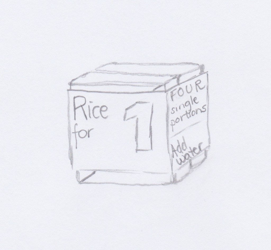
A – Adapt / Adjust Adapt the packaging to single portion-packages, to accommodate single person households. Each package could have lets say 10 single portions within it.
M – Modify / magnify / Minify Reduce the size of the packaging as much as possible, to reduce cost of transport and of the packaging itself. The more air in each pack of rice, the higher the cost of transport. The smaller the packaging, the cheaper. Obviously this is very simplified, but this works as a simple guideline.
P – Put to other uses The packaging also works as a bowl, by adding water to the packaging one can both make the rice in the bowl and eat out of it.
E – Eliminate Eliminate packaging all together- sell rice like fruit or vegetables – by the kilo. I’m not so sure this is a good idea, but it is an idea.
R – Reverse / Rearrange Reusable packaging, with a way of depositing the packages for a refund. Probably more useful in those parts of the world where rice is a huge part of everyday meals.
I chose to work with P – put to other uses.
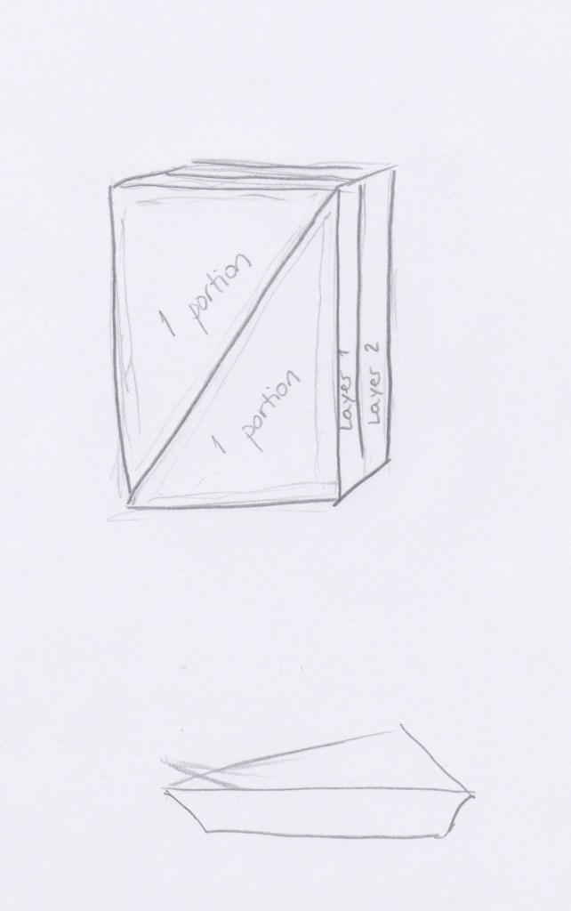
I sketched up a package that consists of four single portions. The package within the carton is made from biodegradable plastic that can withstand heat, two portions in each layer. These two have to be broken apart, and are independent bowls that are perfectly sized for one portion of rice. By adding water into the bowl the rice is ready to eat within 5 minutes.
It might also work with four portion in one layer, each layer being broken off into four.
Maybe it would be a good idea to add seasoning within the package, which would be optional to use, so that the rice could work as a meal by it self.
Pros and cons. Packaging rice like this involves packaging a lot of air, which I doubt can be done very cost efficient. However there is much to be said for not wasting any food. Cooking two, or more, portions, when you only need one, is a waste of both money and food. In this perspective I think this way of packaging rice can be well marketed.
Inspiration / sources: As I am terrified of copying what other students have done before me, I have not looked at their assignments until after I was more or less done. There are noodles and mashed potatoes, among others, that can be bought in a plastic cup and by adding water one has a meal. My idea might originate from having seen that. MrLee, Mama and Toro have different versions of this.
“You are given a teaspoon as an object. Now apply each one of the SCAMPER techniques to it and give a brief explanation of what new product comes of this and how it can be marketed.”
S – Substitute Substituting the material with something more environmentally friendly; possibly bamboo or a recycled bio-degradable polymer. Anything environmentally friendly can be marketed to a broad selection of people, especially younger generations.
C – Combine Making a tea spoon from a sugar material, or preferably a non calorie alternative such as Stevia, that dissolves in hot liquid could be useful, both for coffee and tea. This could be marketed and sold at any grocery store.
A – Adapt/Adjust Using a material that changes color depending on the temperature of the drink or food might be useful for both babies/children and elderly people. This could be marketed towards nursing homes, hospitals, kindergartens and to families of both young children og elderly people.
M – Modify / Magnify / Minify Modifying the length of the handle, adding a non-slip material would make a teaspoon easier to handle for someone who had problems with holding on to something small, elderly people or others with physical disabilities. It could also be useful to make a teaspoon with a bend at the end of the handle, to stop the spoon from slipping into the drink. These could be marketed and sold at any store selling kitchenware.
E – Eliminate Eliminating the use of plastic teaspoons (and anything else made of plastic) would be a great gift to future generations. This is already widely known, but let’s keep “marketing” this to everyone.
R – Rearrange / Reverse Making a teaspoon with two different sizes of spoons, one in each end, might be useful. The handle should be of some length so one doesn’t have to hold on to the spoon-part of the teaspoon. This teaspoon could be marketed and sold at any store selling kitchenware.
Many, if not all of these ideas are already out there, and can be bought in stores all over the internet. As I was researching for this assignment I found that many of my fellow students have had similar ideas also, and to not be completely discouraged I decided not to look too much at what others had done before me on this assignment. It is still early days, and there is a lot to learn when it comes to coming up with new and creative ideas.
As part of academic week 2s LAs we were to “research the history of the fast food chain McDonald’s, and explain which parts of the SCAMPER method are evident in its development onto its current success”.
The SCAMPER method
SCAMPER is an acronym; S – Substitute C – Combine A – Adapt / Adjust M – Modify / Magnify / Minify P – Put to other uses E – Eliminate R – Reverse / Rearrange
The SCAMPER method is a way of structuring a creative prosess, and by questioning a product from these angles one can come up with new ideas. Alex Osborn identified the nine principle ways of manipulating a subject. Robert Eberle gathered them into this acronym.
Throughout the history of McDonald’s one can see evidence of the SCAMPER method.
As the McDonalds-brothers realized that most of their profits came from hamburgers, and not hotdogs or barbecue (S – substitute), they created a streamlined and efficient system with a simple menu, mainly consisting of hamburgers, french fries and soft drinks (A – adapt). Carhops were eliminated (E – Eliminate), and now an efficient self-service establishment, the restaurant’s name was changed from “McDonald’s Bar-B-Que” to simply “McDonald’s” (M – Modify/Minify).
McDonald’s invented the Happy Meal, which combined hamburgers with toys (C – Combine), and having play areas (A – adapt) they have made families and children a high priority customer. Ray Kroc, who eventually bought the business from the McDonald’s-brothers, was a huge part of developing McDonald’s. Starting out as a food stand it developed and grew to regular restaurants, drive throughs and the concept we now know as fast food (R – Rearrange). McDonald’s has always been a creator of trends other businesses have wanted to follow. Who knows where they will go in the future.
As part of this weeks LAs there were listed four puzzles for us to solve.
Puzzle one: A man is replacing a wheel on his car, when he accidentally drops the four nuts used to hold the wheel on the car. They fall into a deep drain, irretrievably lost. A passing girl offers him a solution that enables him to drive home. What is it?
My answer: She jumps in the passenger seat and lets him drive her car home. I’m quite certain she is his sister, by the way. As she loves him and doesn’t want him to take unnecessary risks, she does not mention that he could have used one nut from each of the other wheels to drive home. That would not have been safe.
Puzzle two: Two Russians walk down a street in Moscow. One Russian is the father of the other Russian’s son. How are they related?
My answer: They are a couple, I would presume. Or at least they once were.
Puzzle three: What occurs once in June, once in July and twice in August?
My answer: The letter “U”.
Puzzle four: Six drinking glasses stand in a row, with the first three full of water and the next three empty. By handling and moving only one glass at a time, how can you arrange the six glasses so that no full glass stands next to another full glass, and no empty glass stands next to another empty glass? What is the minimum number of moves to solve this puzzle?
My answer: I would take the middle full glass and pour the water into the middle empty glass, before putting it back. Assuming that counts as one move, the answer is one.
Part of our first MA (Mandatory Assignment) is to make a schedule for when to submit our MAs, projects, exam and portfolios. I chose to make mine in Excel, rather simple, yet I feel the colors make it easy to distinct what are the important “Submit by”-dates.
I would have liked to make the list “perfect” by having the correct names of every MA mentioned in this list. However, in Moodle, under Project Delivery Classroom they are written in norwegian. In the “Semester Plan” excel file they are in english, and some are missing (ex. MA05, without more specification). I chose to use the “Semester Plan” as template, and whilst not perfect, hopefully this is still correct.
Getting to know Moodle as my new “classroom” is a big task. Making a simplistic map of it made sense, as it’s so easy to overthink this task (which I could totally do). So here’s my version of a map of Moodle.
I started off even more simple. Just to show the process, here’s a couple of versions.
Version 2
Also quickly found that my beloved Canon scanner does not really work with drawings with pencil, so I will use an other alternative the next time around.
“Det har jeg aldri gjort før, så det klarer jeg helt sikkert.” – Pippi Langstrømpe –
I have never tried that before, so I think i definitely should be able to do that.
— Pippi Longstockings –
Day 1, and somewhat overwhelmed, but still so, sooooo happy to finally be studying graphic design. Welcome to this blog/journal which I am willing to bet will only get better.