During this lesson task you will get familiar with working in a darker environment and how it affects buildings and people while using slow shutter speed.
- Wait until it’s almost dark outside. Take your camera and go and sit in a busy tourist area. Choose a building or statue to photograph. Place your camera on a tripod and set the shutter speed to 30 seconds or more (if you don’t have a tripod, something stable, like a chair, will also work. If you don’t live close to a busy street, just get one or two people (or even your dog) to move up and down past the camera during the 30 seconds).
Take a look at your photograph. Do you see a lot of people in it or just the building/statue? - Wait until it’s dark. Go and stand on a bridge over a busy street (or look from the window of a high-rise building). Place your camera on a tripod and set your shutter speed to 30 seconds or more. Inspect your photograph. What do you see?
(If there’s no bridge or high-rise building close to where you stay, find a street where there are some cars driving or alternatively ask a few people to help you by driving up and down your street. You can even pay an taxi/uber-driver. Ideally you should capture this from a bit higher than street level. You can ask a hotel in your area to use their window or the flat of a friend that stays on the second floor. Some buildings have a secret stairway to the roof… be creative, and safe!) - Ask a friend to help you with this activity. Choose a dark room in your house and switch off the lights. Place your camera on a tripod and set your shutter speed to 30 seconds or more. Ask your friend to “draw” a picture in the air using a flashlight. Take a look at your photograph. What do you see? This fun activity is called light painting. Try an easy pattern first, but also a more complicated one.
As I only had one evening to do this task outdoors, it was not ideal, but these were a few the photos I took.

There are no “touristy” places these days, but this is as close as I got. No people, but cars passing by at least. Sadly this lady is a little unclear, but this is was still the best example.
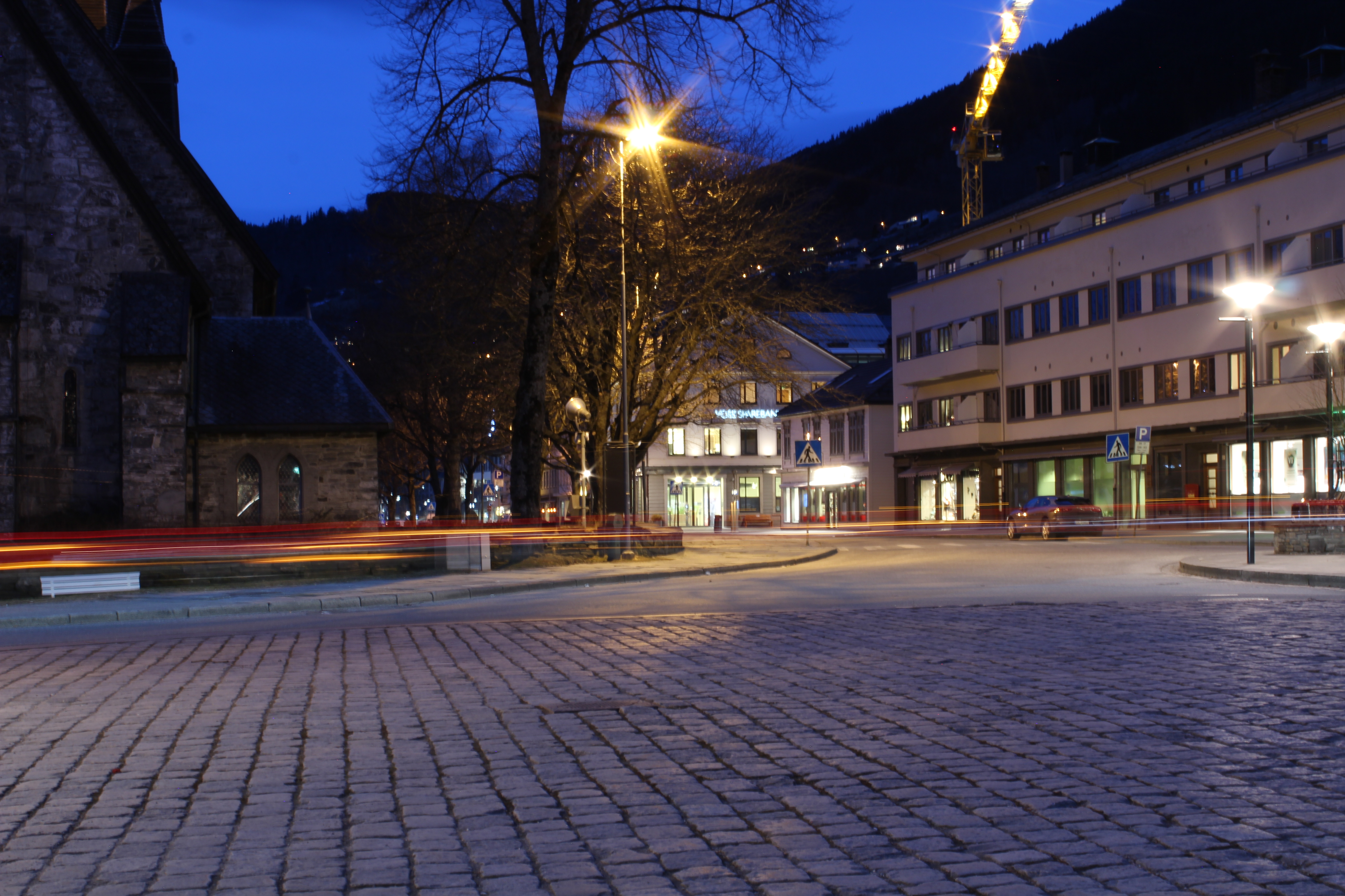
ISO 100 – 37 mm – f. 20 – 30 sec 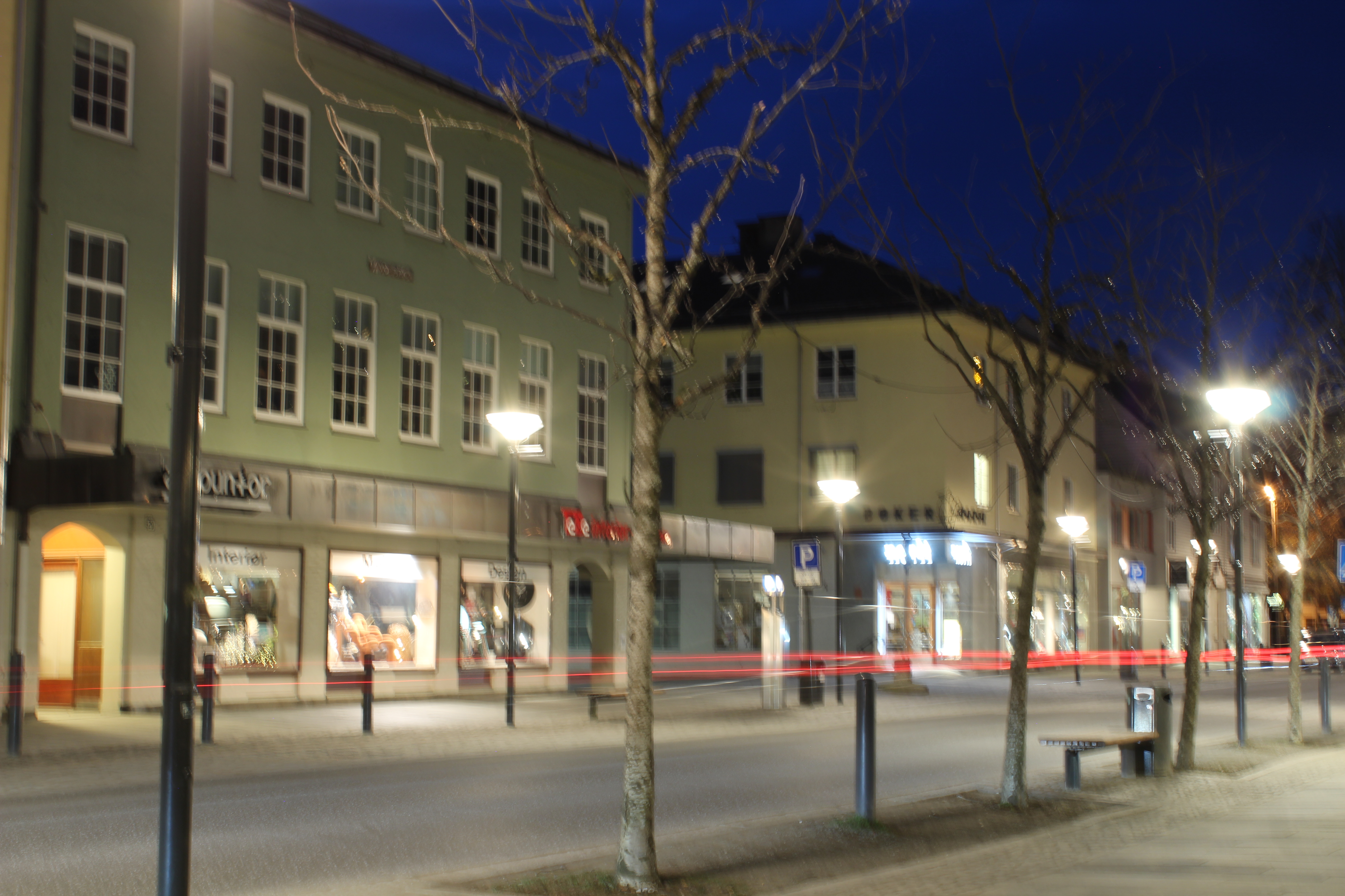
ISO 100 – 18 mm – f. 18 – 10 sec
There are no places with a lot of traffic at night here, so I took pictures of the few moving cars in downtown Voss that night.

ISO 100 – 55 mm – f. 14 – 2.5 sec 
ISO 100 – 55 mm – f. 11 – 1.6 sec 
ISO 100 – 55 mm – f. 11 – 1 sec
Drawing with light – I did this assignment outside with street lights. In the first one I tried to make the @ which was semi successful.
Shooting in Low-Light Conditions
Question 1
Written assignment (4 hrs)Describe the steps that you will take to ensure that you take a high quality photograph in low light conditions. Refer to exposure, lenses, tripods, colour temperature, flash and ISO. Your answer should be a minimum of 350 words.
To take good photographs in low light you need:
- A tripod to keep the camera steady.
In darker conditions the shutter speed is higher, meaning the shutter will stay open for a longer period of time. If the camera is moved, even the slightest shake, the picture will be blurry. A remote shutter release can also be useful. - To use longer shutter speed for longer exposure, making sure enough light is brought into the photo.
- Any lens.
- To keep the ISO as low as you can, preferably to a 100 to reduce digital noise in the image.
- A flash can come in handy, but is not absolutely necessary.
Question 2
Practical assignment (1,5 days)
- Watch the LinkedIn course:

Photography 101: Shooting in Low Light by Joseph Linaschke - Take four low-light photographs.
– One should be a sharp photograph that focuses on a static object, like a building or statue.
– The second photograph should showcase moving objects, like cars or running water.
– For the third photograph, take a moody portrait of a friend and use high ISO settings to your advantage.
– The fourth photograph should explore using external light sources, like a Speedlite flash (please note, if you don’t have the equipment to take this last photograph, you may leave it out).


 The Institute of Contemporary Art in Boston calls him one of today’s best known and most influential street artists. His work is included in the collections at The Smithsonian, the Los Angeles County Museum of Art, the Museum of Modern Art in New York, the Museum of Contemporary Art in San Diego, the National Portrait Gallery in Washington, the Virginia Museum of Fine Arts in Richmond, and the Victoria and Albert Museum in London.


