This week the topic is Typography, which I LOVE! So much fun learning the “rules of engagement” though a bit overwhelming. I know this will have to stick, like forever, so really trying to soak it all up.
Question one:
Create a new word; one which has no dictionary definition and a meaning that only you know. For example, the word we came up with is “roleean”, it doesn’t appear in the dictionary, but it means, “round and leaning to the left”. You could decide on your own word with its own meaning. With regard to our new word “roleean”, this might involve emphasising or dramatically enlarging the letter “o” within the word, and using italics, allowing the letter to lean to the side.
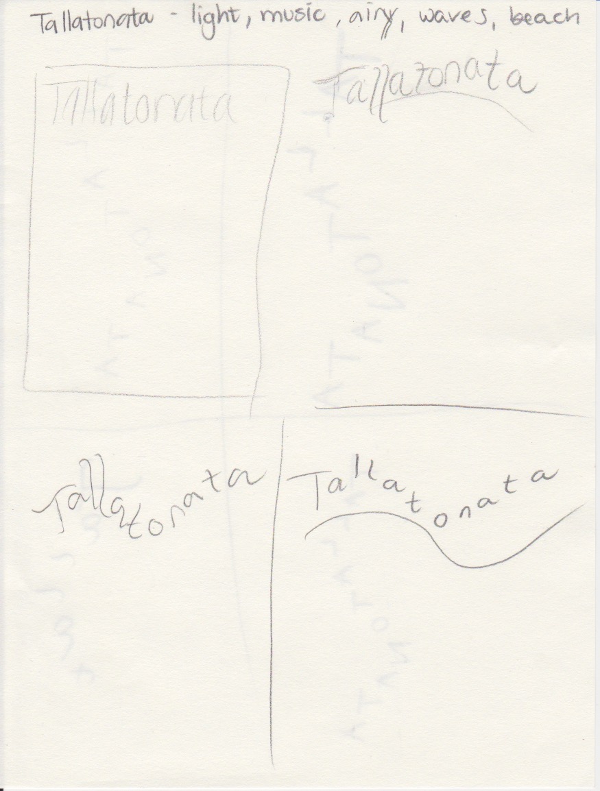
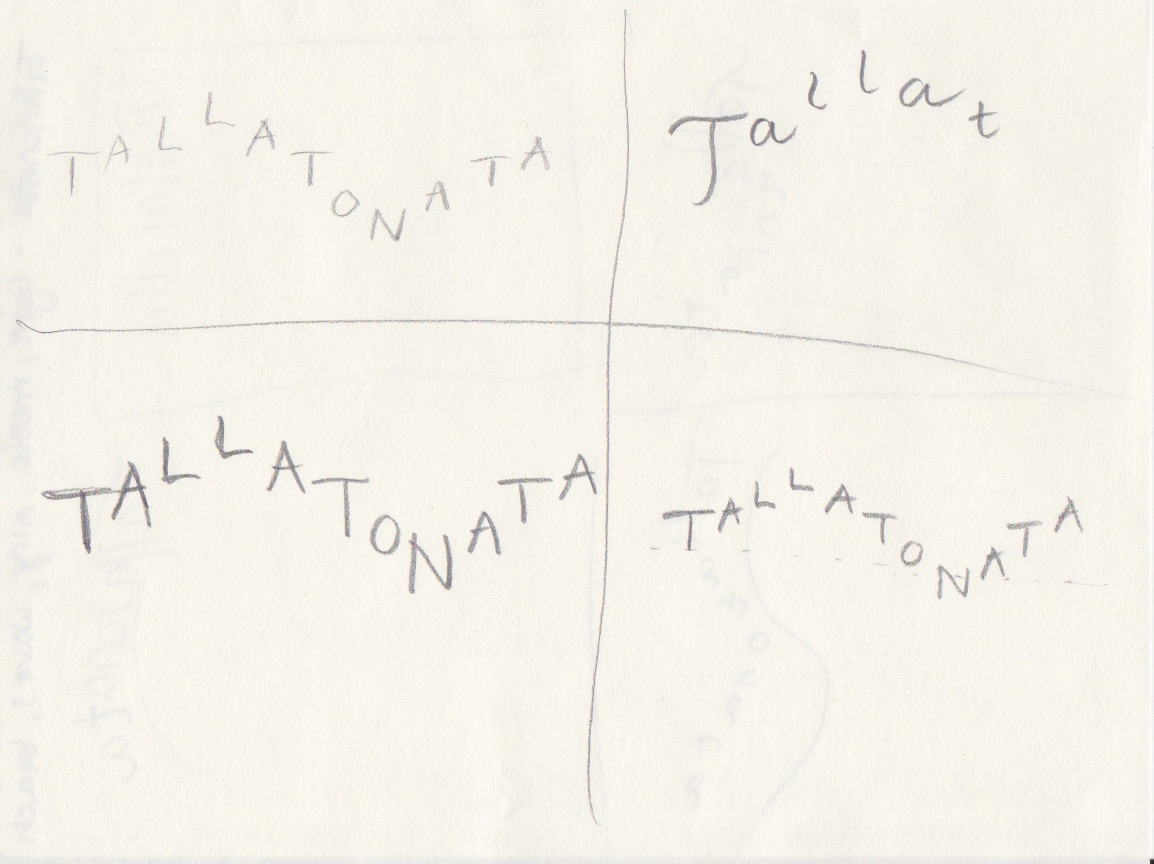
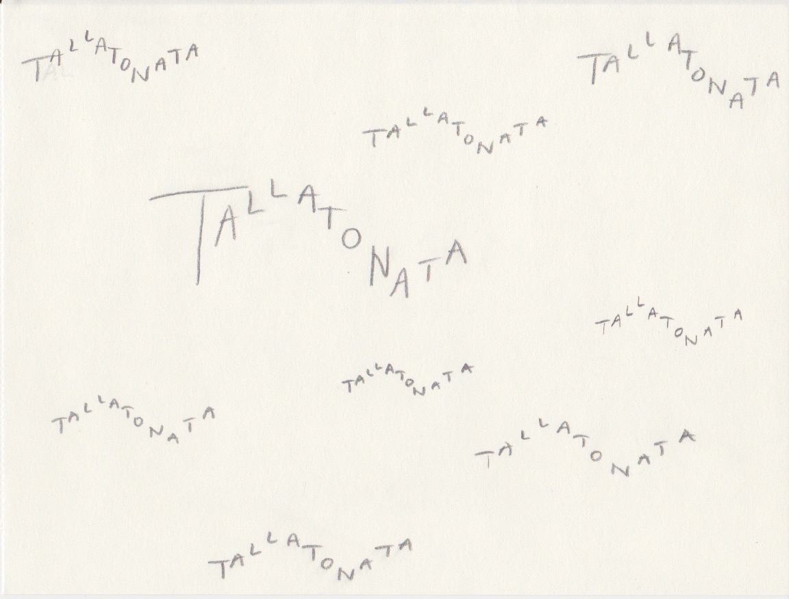
Oh, this was hard! I made a few words, googled them and realized I am not at all as inventive as I thought I was. However, I did finally come up with a word that does not exist. The sound the waves make when they hit the beach is called:

“Tallatonata” is a long word, and I wanted to use the length to symbolize the waves. The idea was quite simple, but yet it took a lot of trial and error to end up with this version. I searched for a font that was light enough for this feeling, and that would form well as waves. It’s called Amatic SC, and I downloaded it from Creative Cloud. I used different tracking and sizes, and also made a couple of them in Bold.
Question 2
Now choose two extra words from the list below:
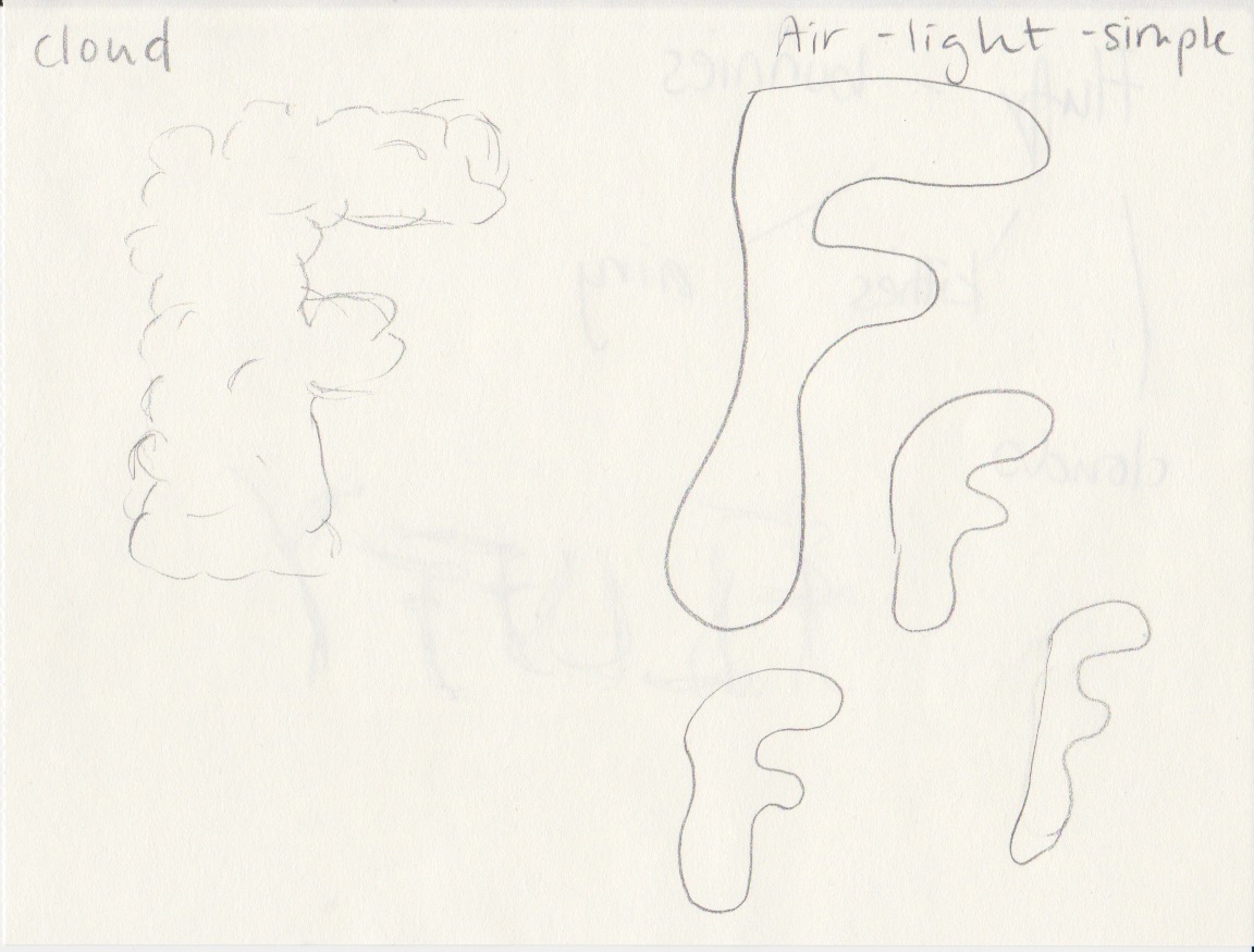
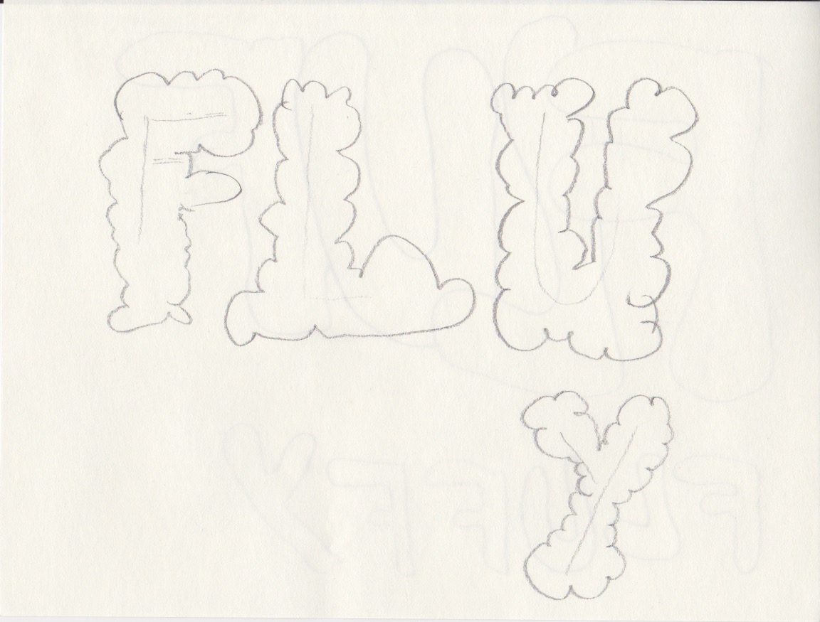
- Fluffy
- Falling
- Slimy
- Agony
- Sailing
- Rock-Solid
- Loading
- Pizzaz
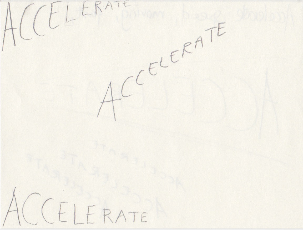
- Accelerate
- Elevate
- Create
- Inspect
Create three different compositions, showcasing your three words, one word per composition. In each composition, arrange each individual word to express its meaning, using only the colours black and white. Consider all and any means at your disposal: dramatic scale contrasts, cutting, repetition, letter spacing, etc. Each composition should fit onto an A4 format. You can play with the size, spacing, placement and orientation of letters while being cognisant of how the word(s) interact with the entire format.Consider the entire format as an important design element: use all available space; don’t simply centre the word – think of this as an opportunity engage the viewer throughout the entire layout. Experiment. Play. Push to the edges of the page. Repeat elements if it helps to get the meaning across. Choose a very simple creative solution, if you find this direction more appropriate.Make sure to only use one typeface for each composition, noting the suitability of the choice of typeface to the individual word; you can experiment with various styles (light, bold, condensed, uppercase, lowercase). You may repeat, omit, slice, block or overlap words or letters. However, please do not use drop shadows or similar computer-generated effects.
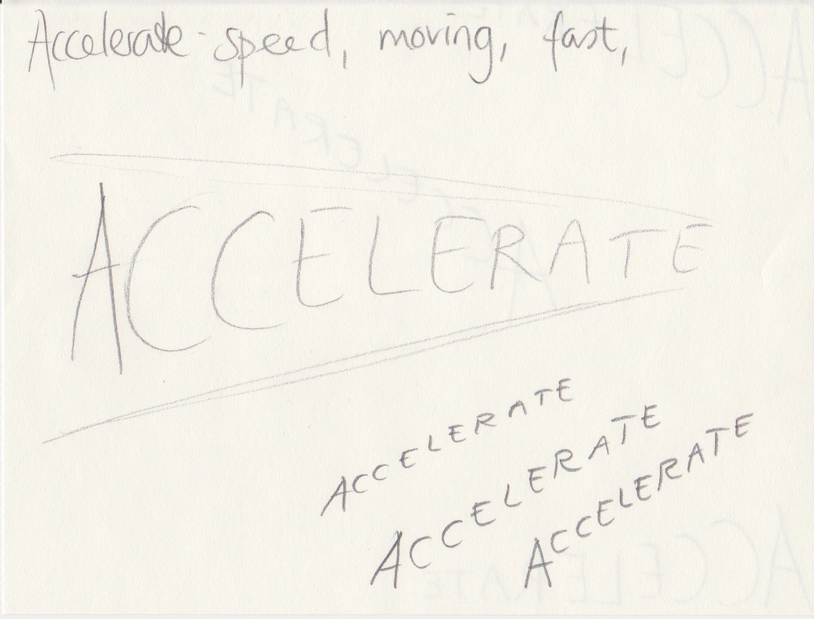
I chose the words Accelerate and Fluffy.

Accelerate:
I wanted to make the word seem to actually speed up. I used baseline shift, while also making each letter smaller. A lot of doing and redoing, but I felt the result was okay. The typeface I used, again from Creative Cloud, was Aviano Future, and I ended up with Black Fast. All of the fonts from this typeface marked “fast” leaned to the right and felt appropriate for this word. I placed the word at the bottom of the page. Possibly a frame would have made that clearer, but as it wasn’t mentioned in the assignment, I left it like this.

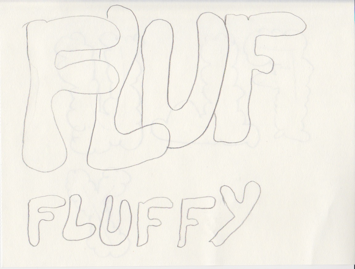
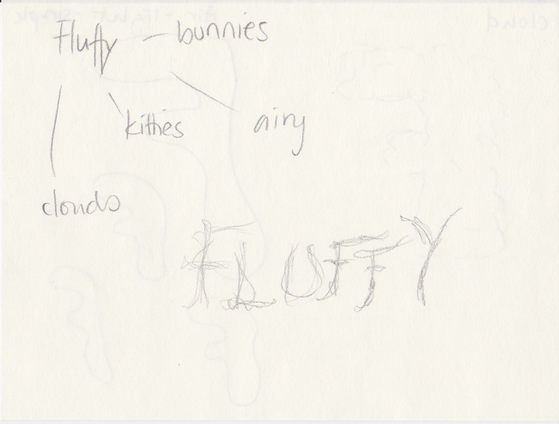
Fluffy:
The typeface I chose for Fluffy is called Bubblegum Pop and I ended using “Shadow”, which to me was the most fluffy font I could find. I filled the entire A4-page with the words, and I like how it looks. Again, I tried a whole lot of different settings. At first I thought I would only have the word once on the page, but playing around I felt like this works better.
Question 3:
You will need to supply all your preliminary sketches and ideas along with the final layouts – the foundational process of drawing by hand is important. You can start your project and explore ideas by tracing letters, cutting and pasting computer-generated words, photocopying or photographing; be inventive. Later, once your ideas are developed, you can use a program such as InDesign or Illustrator to rework and refine the design. Take time to consider the various options; don’t just do the first thing that pops into your mind. Explore all possibilities for enhancing your ideas.
I worked in InDesign, and it’s a first. Loved it. Just barely scratched the surface here with a few helpful videos from LinkedIn Learning, but oh, this is going to be so much fun!
My sketches are seen below: